
Great user experiences (UX) start with great components. In the SitaWare suite, Systematic’s Command, Control, Communications, Computers (C4) Intelligence, Surveillance, and Reconnaissance (ISR) solution specifically tailored for military operations, we work with Storybook to create UI components shared for various applications. This helps us move faster while scaling the organisation and maintaining excellent quality.
By Anders Holm, Senior Systems Engineer
Scaling the organisation
As our organisation grew in recent years and more teams joined, we faced challenges maintaining consistent UX and design across the product suite. In addition to that, an increased complexity in high-performance frontend development was observed, and we acknowledged the need to address it.
We simply needed a new way of making UI components.
We achieved part of the solution by developing a UI Component Library using Storybook and creating a new Test Paradigm.
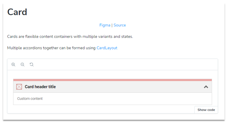
Storybook
Storybook is a framework for developing UI components in isolation and displays different permutations of a component in something called stories.
It is a tool that significantly improves the developer experience by supporting hot reload, publishable component overview, and add-ons.
Using Storybook supports our UI Component Library to achieve success in the following areas:
- Speed and quality: Using Storybook provides a platform where components with various states can be worked on with almost instantaneous feedback on code changes. If something can be implemented quickly, it is a lot easier to make the right decision on how to code your components.
- Scaling the organisation: With a growing organisation comes increased complexity and difficulty in onboarding new employees to our way of working. Using components with simple interfaces helps create correct solutions quicker.
- From variability to consistency: We noticed a trend of increased variation in the components being developed, based on the same design. The root cause is the increased number of developers, trying to learn as they go. We are trying to change this trend towards a more consistent platform of UI components with Storybook in the centre.
- Modernisation Journey: We’re saying goodbye to old AngularJS code and gradually replacing it with modern, high-performance Angular code. Storybook is the scaffolding in this process to ensure that all new code introduced matches the design guidelines.
Making the complex simple
As a developer, I aim to empower my fellow developers to create better features faster by equipping them with UI components. These components must be simple to use and structured to reinforce correctness through its use. Using a shared UI component library with Storybook provides the following benefits:
- Efficiency: You automatically get correct styling and behaviour, and any central changes in the future will automatically be applied to your component(s).
- Shared understanding: We base any discussion about the components and their use on a shared understanding of the design principles described by UX/UI.
- Suite alignment: Developers across teams or programs create similar UX for the end-users. Users do not care how we structure our development teams; they just want great software.
- Design specs: Colours, fonts, and design specs are the same across multiple products and teams. You can only change what is supported by the designs. By using the component, you already cater to the design specs.
How we ensure this simplicity:
- Component input never directly controls styling. For example, you will not find a component input for height-taking X pixels. Instead, you will find the height input taking ‘small’, ‘medium’, or ‘large’, which the component then translates to actual values.
- Degrees of freedom are low. We have components with few inputs. The components are purposely made with few inputs to ensure only the exact use cases from the designs are supported.
The main point is that if a developer’s design uses a component that does not support the use case defined in the library, then you are most likely creating something incorrect and should reconsider your design. Our experience supports this in most cases, but sometimes, there are special components we do not want to share, and that flexibility is still available.

A new Testing Paradigm
Creating UI components that look and behave exactly as specified poses challenges. Having components, that everyone is 100% satisfied with is hard, as colleagues, product owners, and designers will all have ideas and feedback.
Defects in software are an inevitability, but it remains our goal to create a stable UI with minimal regressions. Knowing when and what to test is an integral part of quality, but using the classic test pyramid to guide us has previously shown that it did not ensure the quality we wanted.
Other tools and testing techniques are needed when dealing with pure UI components:
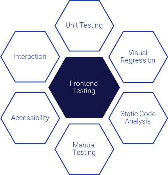
Instead, we use a combination of testing practices at different stages of development.
Creating small and shared UI components rarely requires complex business logic (and we try very much to avoid it for UI components), so testing can be done at different technical levels.
Instead of only relying on formal business requirements being unit tested, the components can instead be developed very efficiently with primarily two testing tools:
- Component testing (primarily interaction testing), and
- Visual Regression testing (Snapshot testing) guarantees interaction as designed and pixel-perfect looks.
We do not prioritise unit, integration, or end-to-end testing. We develop these components with minimal business logic in mind and instead postpone using these testing techniques for the full feature development where the components are used.
Collaboration and ownership is key
We found it essential to have clear upfront ownership of components, both for the design and the implementation. There are significant benefits when UX/UI designers collaborate with the developer(s) responsible for a UI component. Designers gain insight into how their Figma-created designs work in real-life scenarios, including unexpected edge cases never thought of before.
We document and test the discussions and their conclusions. However, having a select group of developers work exclusively on these components provides multiple benefits. It prevents redundant discussions, ensures accurate design, addresses defects quickly, and maintains alignment with the goal of how the component interacts with other components, thereby saving time. Storybook strongly supports this collaboration by being able to create and demo code very fast, ultimately ending in better outcomes and user experiences for the end user.

Anders Holm is a Senior Systems Engineer with a passion for crafting high-quality, user-friendly frontends. With a career building mission-critical systems in both the Healthcare and Military domains, Anders has developed a mantra of continuous development and relentlessly seeking to understand what the customer needs. You won’t be surprised by the barrage of questions from Anders about what the user really needs and see him trying to solve it in the best possible way.
Learn more about us

See vacant positions
We are always looking for people who strive to be the best in their fields - see the current vacant positions.

Working at Systematic
A common feature of these core business areas is a need to integrate, compare and analyse large volumes of complex data, and to generate an overview that allows decision-making based on a solid foundation, often in critical situations.

Why Systematic
With a career at Systematic, you gain responsibility and trust from day one. Read more about why you should choose a career at Systematic

How we work
Our unique model for software development is based on CMMI5, Scrum, and Lean. Read more about how we work at Systematic »

Our social culture
We place great emphasis on traditions and events such as the Christmas party for the whole family, the annual summer party and the DHL relay run.